- by Rumblecakes |
- Painting And Drawing
- | Submitted on 01/14/2011 |
- Skip
- Title: practice #2
- Artist: Rumblecakes
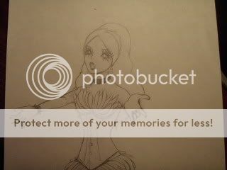
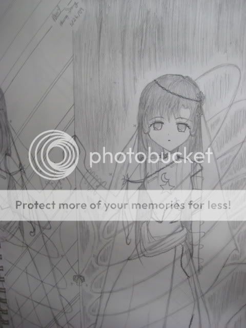
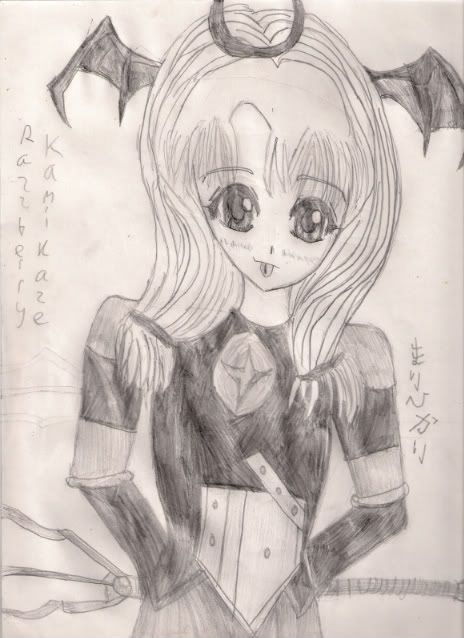
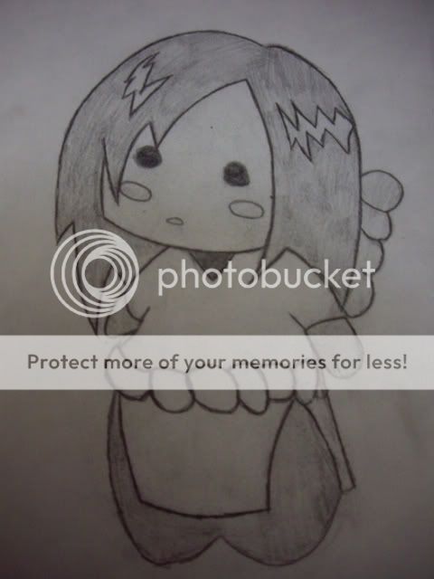
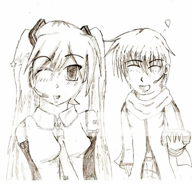
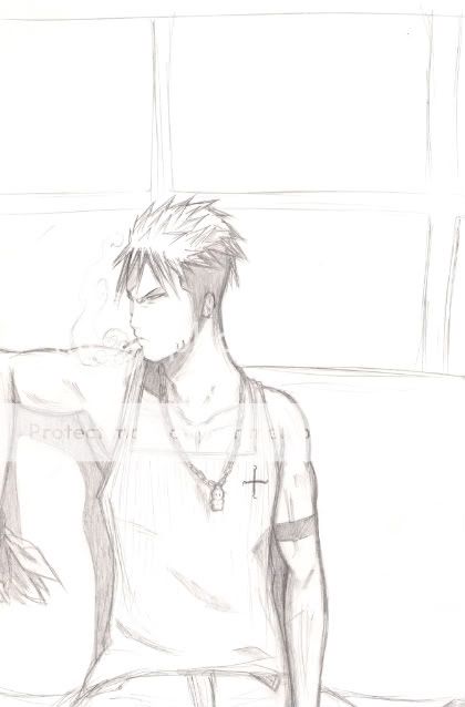
- Description: Hello everybody! Ive been drawing manga for a few months now and decided ill start posting some here on gaia. the reason for this is that i need some tips or suggestions to help me achieve my goal of becoming a pro! so plz comment or rate.thank you.
- Date: 01/14/2011
- Tags: practice
- Report Post
Comments (3 Comments)
- T0m0y0-chan - 10/25/2011
-
Love the detail! I have to agree with Josephine though, for some reason he looks like he's attached to the desk and it seems really flat. perhaps it is because you've got shading in some areas and we expect to see it where it should be as well.
BUT ITS REALLY GOOD! - Report As Spam
- Fille aux Cheveux de Lin - 01/22/2011
-
It seems a bit flat/skewed, as if the guy in the chair is a cardboard cut out leaning forwards. I think you should try to inaugurate more depth and shading into you work.
The guy in the background is annoyingly 'chippy' compared to the rest, his forearm is a bit too short to be anatomically correct, I believe.
Try shading the boss's hair a bit more.
Keep trying! - Report As Spam
- EZBakeZombie - 01/16/2011
- Not bad I like the smirk or whatever on the guy in the background :]
- Report As Spam


