- by geekypnai13 |
- Painting And Drawing
- | Submitted on 04/18/2009 |
- Skip
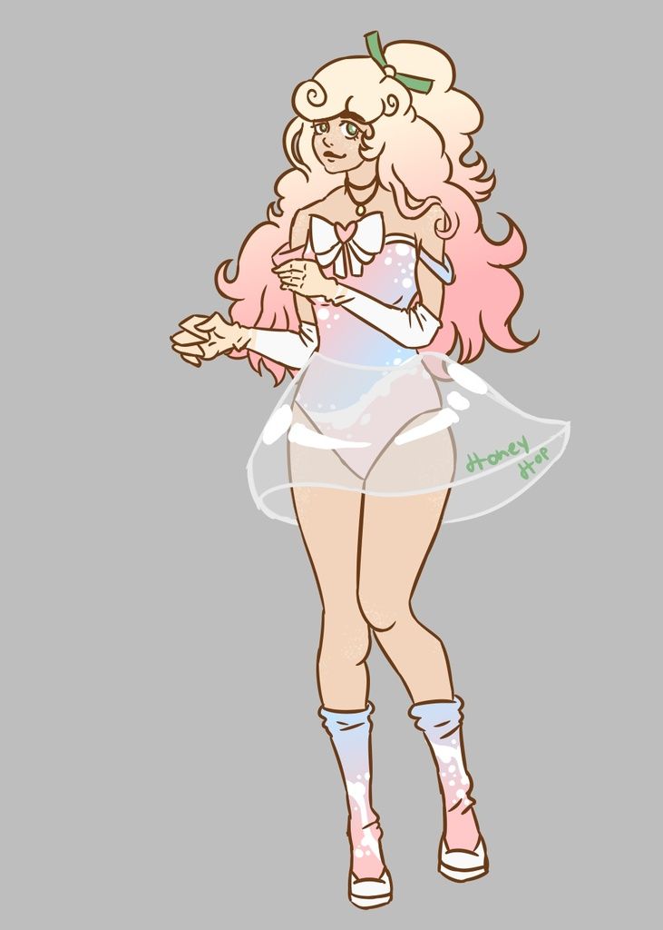
- Title: it's serious now lol
- Artist: geekypnai13
-
Description:
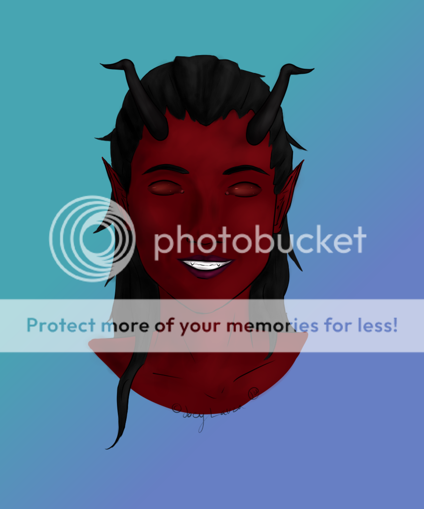
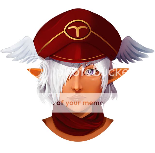
ok this is my "serial" works of art...
this is how it basically is
plus, there's an annoying line thing on his head that distracts me most, and i can't edit it out...
so yah... deal with it
i sorry
*sniff*
so how can i work on this depth problem i am having? - Date: 04/18/2009
- Tags: serious
- Report Post
Comments (7 Comments)
- Xinaeve - 05/10/2009
- Absolutely love it. 5/5
- Report As Spam
- cilantros - 04/19/2009
- it looks very cool...but the eyes look like theyre looking in different directions
- Report As Spam
- filth_13 - 04/18/2009
- This is very good.
- Report As Spam
- BOMBxCHELLE - 04/18/2009
- I enjoy how it is so simplistic, but yet so detailed in shading. melanie's right, you could've added more depth, but props to you!
- Report As Spam
- Spazz Rabbit - 04/18/2009
- Beautiful. =)
- Report As Spam
- dooglebob - 04/18/2009
- I love the smoothness of the shading, but the picture lacks depth overall and his eyes are too far apart. However I like the detail on the strap and neckline and his hair looks so soft <3
- Report As Spam
- Lily the Merciful - 04/18/2009
- wow its amazing!! love it ! biggrin good job! :]
- Report As Spam


